Welcome To My New Website And A New Year!
/
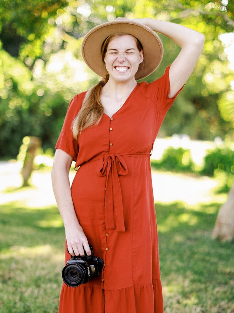
HIya, friends! Happy New Year! This is a joyous time filled with new beginnings and let me tell you, this post is a jolly whopper! Today, I’m taking you along as we view my new site and talk about what’s to come this year! Let’s go!
I am no designer, but I’m proud to welcome you to the refreshed KTP website! My journey up to this point has been one of discovery and finding a meeting place between who I am and communicating it well in the artistry/photography industry. There are a few main aesthetic features I wanted to incorporate from day 1 but didn’t really know how. I discovered that some of those features I wanted were only available through coding and the rest were via the use of my site provider. Let’s talk about those aspects.
my goal
to invite you into my world and express hospitality through artistry
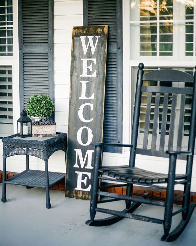
An immersive background. I knew I wanted my site to be a world of its own. And one of the biggest parts of the site is its background and canvas. I pulled images from my recent shoot Season of Surrender because it was shot at my family home where I lived for around 8 or 9 years. I’ve always loved that piece of land and have great plans for it. The oak tree could quite possibly be around 100 years old or older, so there’s this feeling of closeness to something bigger than myself. I love it so.
Framed artistry. Following the thread of home and hospitality, I chose to frame every image on my site to give the illusion that you’re viewing the gallery walls in my home or visiting a luxurious gallerie in Paris! (LOL, it’s equal parts common and whimsy!) We frame all our most precious moments to give them emphasis and to attract attention.
Old World Serifs. Not to get too fancy here, but the fonts and serifs were important to me. Quite simply, I have a deep appreciation and love for history. I believe it is imperative to remember where we have come from as humans as well as the lessons we’ve learned along the way. I used to LOVE the American Girl series when I was a girl (well, heck, I still do….I read through their Christmas Collection not two weeks ago…..). These fonts speak not just of history but of the feelings that prevailed long ago. Visions of perseverance, simplicity, and purpose. I am a simple person with no large demands of life upon which my happiness depends. I so resonate with the 16th and 17th century, along with many inventors, artists, scientists, literary giants, and politicians of the time. What is the saying, “I was born in the wrong era?” While that may not necessarily be true, I believe that I was born for such a time as this, so that I could recognize so many of the glories of the Old World while boldly living in the New.
Copy. So, not to get too technical, but website copy is something I had no idea was a thing until recently. I discovered Ashlyn Carter who is a conversion copywriter and I learned SO much! In short, copy is the words you use on your website to convey the same brand message as your imagery. If you visit a lot of websites and pay attention to the words, you’ll notice patterns throughout the site. Some sites use plain speak, others use formal speech, you’ll find colorful copy, plain copy, copy with regional speech flares (like, “hey, y’all!”, or copy that conveys a high end service. I knew I wanted my copy to be organic, personal, and warm. So spotted thorough the site, you’ll spot some lingo that sounds like you just hopped off the wagon at the farm! :)
Logo and color scheme. My logo hasn’t changed much but that pretty much speaks for itself, and my brand colors scream my love for organic, chill tones. Specifically, what would color would be created if the sky, the grass, a mountain, a desert, the ocean, and a the moors of Ireland all crashed together in one big, beautiful schmushyflushycolor? This was the color I saw. It speaks of my love for outdoors, the earth, cold, warmth, breezes, days and nights. I also tend to gravitate towards cool palettes with bursts of warmth, rather than warm palettes with bursts of coolness. This was perfect. Also, I’m a pretty chill gal so I thought this grey supplement color was just enough chill without being boring. :)
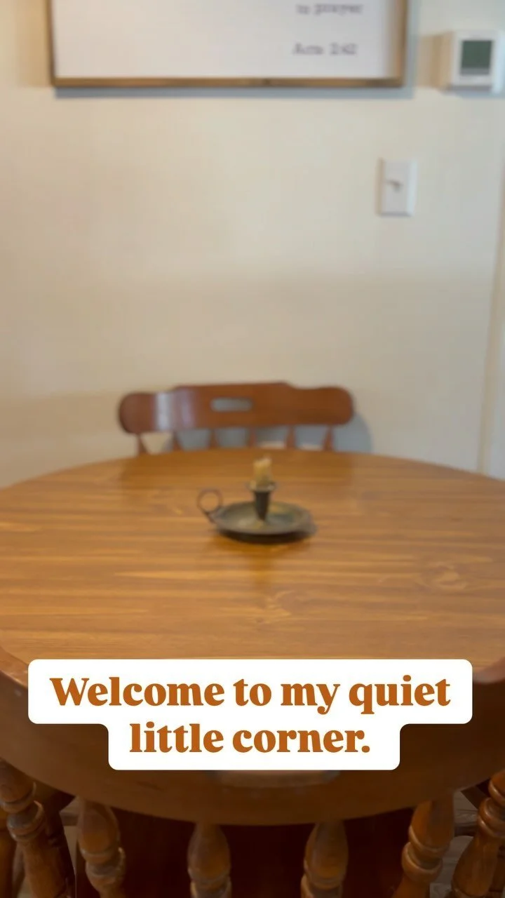
So there you have it! As of now, those are elements that were important for me to convey in this little corner of the internet. I hope you feel the warmth of home each time you visit this site. On to goals for the new year! Now, this post will be strictly business goals, but coming soon is a post with a list of personal goals I’m crushing with Lara Casey’s Powersheets! Whoop! These goals speak for themselves….:)
Coming in 2019:
An emphasis on weddings and seniors.
Workshops!!! (yipeee!!)
Education for both photographers and clients.
Community building in KTP. (A separate blog post coming soon!)
The Kindred Shoppe. (COMING SOON!!)
Ok, so that’s a plateful of stuff manifesting itself in my calendar but the good news is, you’ll be able to totally find info on a few of those things here on the site! If you don’t want to miss a single thing rolling out this quarter, be sure to post me your email address down in the footer and you’ll be included in all the exciting things!
For now, that’s all folks! I’m so excited to share all of my upcoming things with you but I have to be patient and not share it all at once. Slow cooking over here is the way to go!
Don’t forget to share your email below! Tootles!!